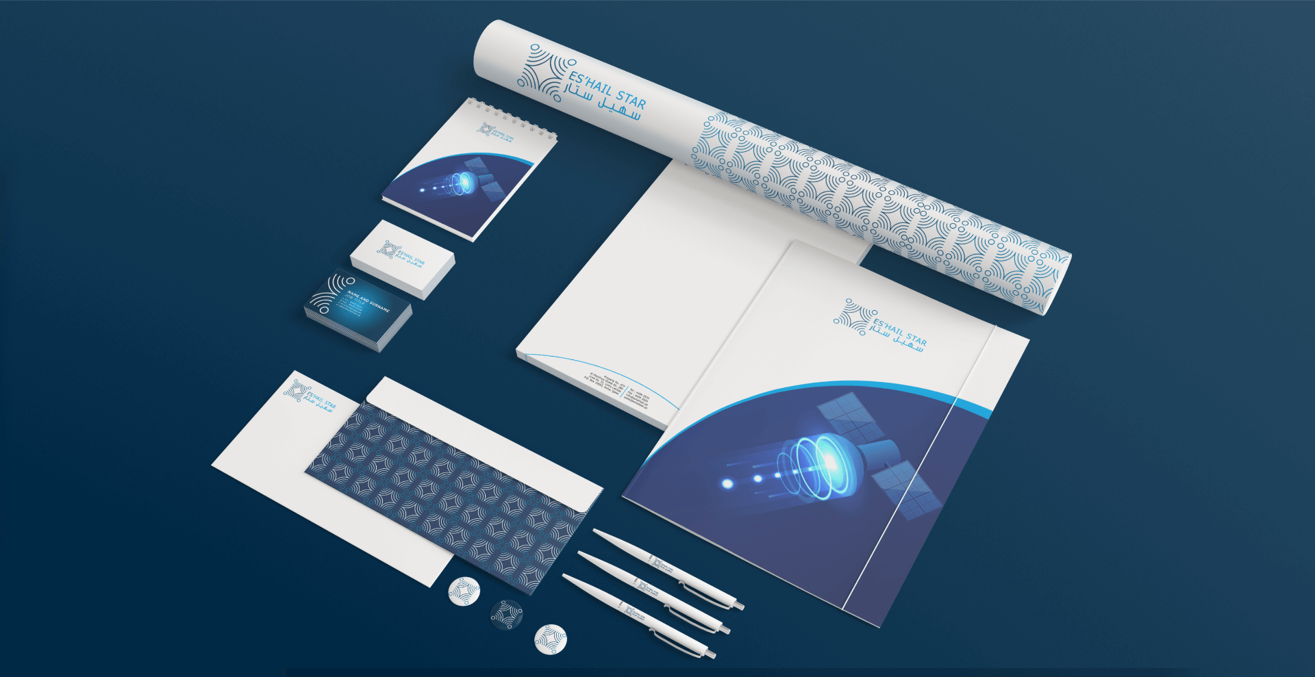
Eshail
Brand Identity Design
Es’hailSat, the Qatar Satellite Company, is a communications satellite operator headquartered in Doha, Qatar. Es’hailSat was established in 2010 with the goal of managing and developing Qatar’s presence in space. The company provides independent, high-quality, advanced satellite services to broadcasters, businesses and governments in the MENA region and beyond.
This project was requested while working at Ogilvy Memac*. The brief was to design two corporate identity options that show a satellite connection. The challenge is to include the name in Arabic and English.
*The two designs were presented to the client, but as of yet not been implemented.
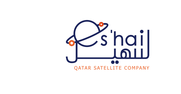
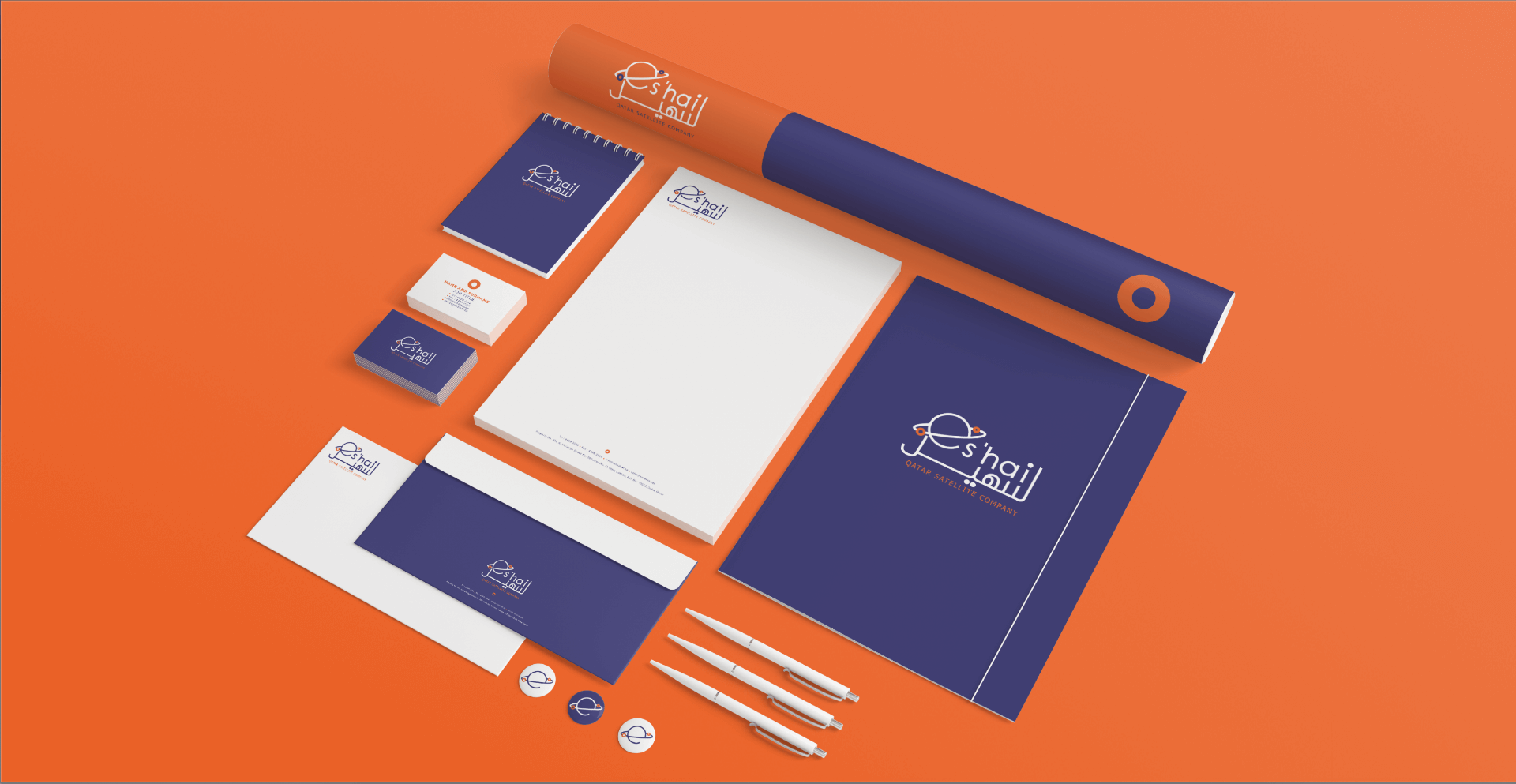
This approach is crafted around the idea of turning the ‘E’ from the name into a symbol that is relative to space. In this direction the symbol is earth with two satellites in the atmosphere.


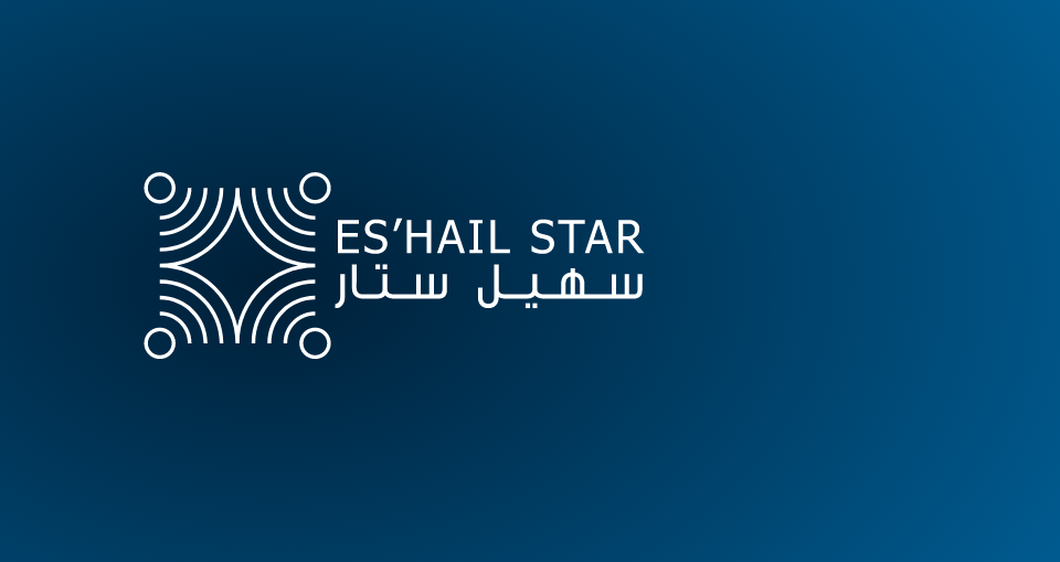
Inspired by a number of elements, this direction combines the symbols of satellite radio-waves to create a star that relates to space and essentially the organisation. As a whole, this design creates a pattern that is familiar to local tradition. This allows our pattern to become an essential part of the brand’s identity across various media and decor, further cementing the brand’s presence.
